Knak
As with any fast-growing company, there tends to be a lot of change. Ottawa SaaS start-up, Knak, was no stranger to this. Continuing to achieve success in the B2B world, Knak was looking to focus its marketing efforts towards an enterprise-level clientele. Joining the team as Art Director, it was imperative that I start by assessing the current state of the brand to ensure we'd be moving forward with a clear and trustworthy vision and voice. With the CCO on board, I began the process...


After assessing the current state of the Knak brand and discussing my findings with the leadership team, I determined 3 key reasons to move forward with a brand refresh.

Differentiation. In order to stand out from the competition, it was imperative that Knak had a unique, authentic, and professional look and feel in the market.
Fragmentation. As is the case for many start-ups, Knak found themselves in a place where several teams had been producing brand assets, and visual styles were now competing with each other. This contributed to a lot of rogue design. At best - this can leave a brand seeming vague or lacking in any clear opinion or character, and at worst - it can leave a brand invisible and unidentifiable.
Evolution. Knak's ideal customer and target audience are enterprise-level companies. This meant there was a clear opportunity to veer towards a more sophisticated and professional look - without losing the playfulness spark of the brand.
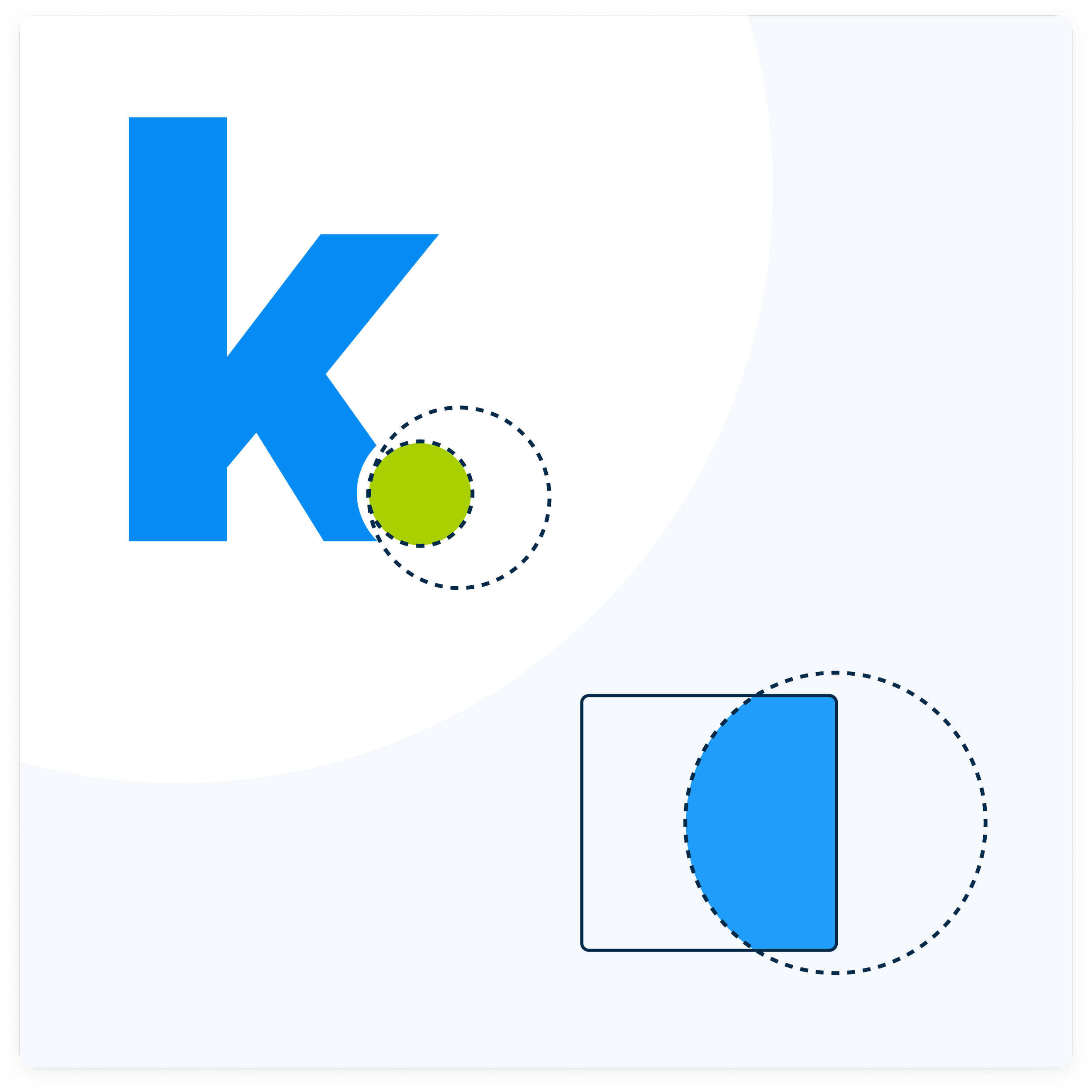
Presenting the sphere shape as a leading design element, I created a visual connection to a feature already found in the Knak logo.
Rather than relying heavily on illustrations and sporadic decorative elements, Knak can now conjure the feeling of playfulness and friendliness by using geometric shapes built on circles and softer corners. These spheres act as a device that draws attention to (instead of distracting from) important content.
Through exploration, testing, and tweaking, I developed an optimized visual brand to present to the team.
This proposed refresh addressed all of the points of concern that were raised through the brand assessment. Logo usage rules were implemented, typography was simplified, colours were optimized and WCAG 2.1 AA compliant, a clean and guided illustration style was created, decorative elements were reimagined to better speak to the Knak brand and logo, and much more.
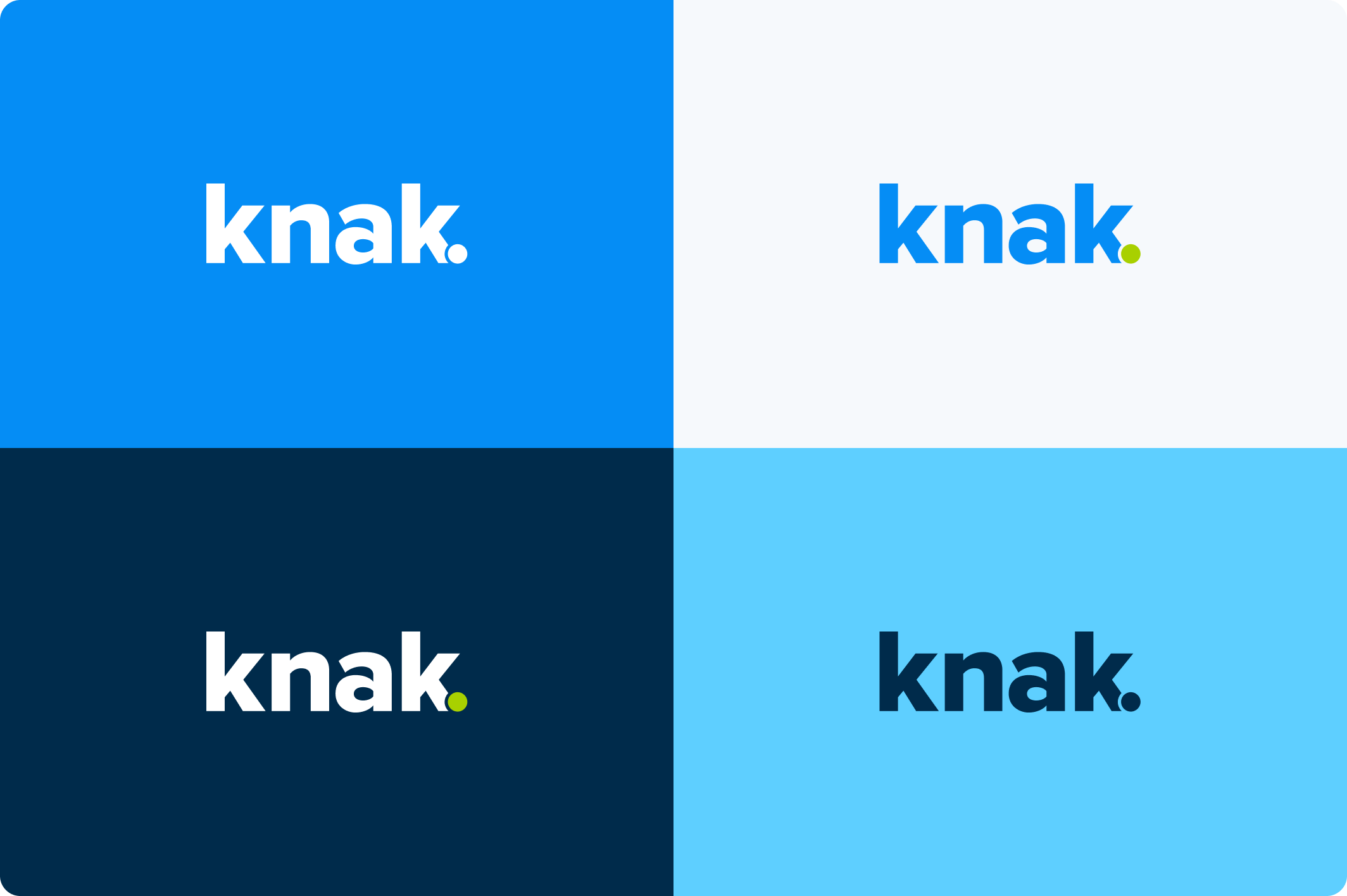


This refreshed visual brand can be implemented in a way that keeps things creative and playful – while maintaining more consistency and sophistication.

